-
COMPANY
COMPANY
We create the future that is
much better than today.
Greeting Company Outline History CI Social Contribution Location
-
PRODUCT
PRODUCT
Laser Diode that is produced by superb
competitiveness & high technical skills.
Red laser diode Infra Red laser diode Certification Epi wafer
-
CYBER PR
CYBER PR
We will become a leading company
that grows with our customers.
What's news PR Movie About LD QSI Photo QSI Competitiveness Global Customers
-
Contact US
Contact US
We will grow in becoming a leading enterprise
that is recognized world-wide.
CI
HOME > company > CI
It is a visual feature that symbolizes the company’s integrated corporate image on the whole and an important factor in the C.I.P(Corporate Identity program)

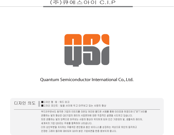
Intention of the design
It displays a gentle and reliable corporate image, as seen in the rounded and bold typography, and
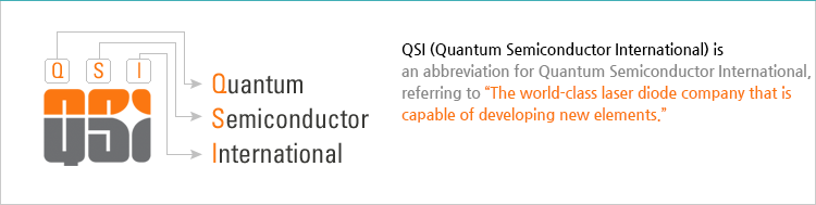
the light penetrating through the letters "S" and "I" directly refers to the laser business areas of QSI Co., Ltd.
Also, there are people facing each other on both sides of the penetrating light, implying the themes of light among people, laser in our lives, and QSI in the world.
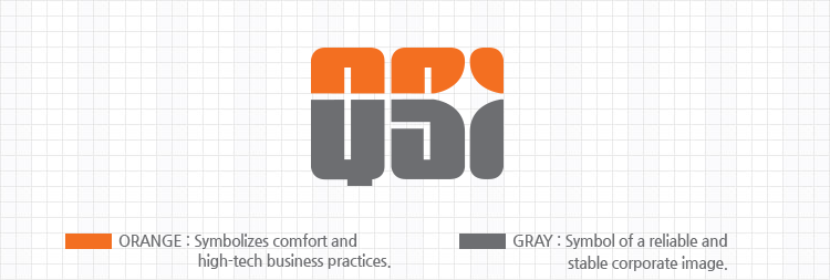
The orange color on the upper part is a color that symbolizes comfort and high-tech business, and it is in contrast with the reliable and stable grey color, making the bright corporate vision of QSI stand out more.
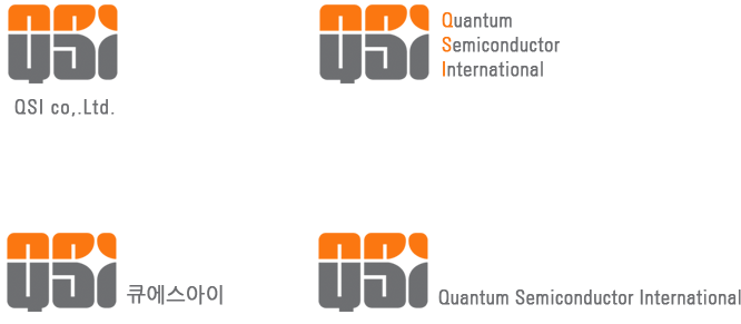
Word mark Identity
Signature
- 17, Cheonheung 8gil, Sungger-eup, Seobuk-gu Cheonan-city, Chungnam-do, Korea 31044
TEL (Sales) : +82-42-410-5055 | TEL (IR) : +82-42-410-5010 | FAX : +82-41-555-5186 - Copyright (C) QSI Inc. All Right Reserved.